UI Components
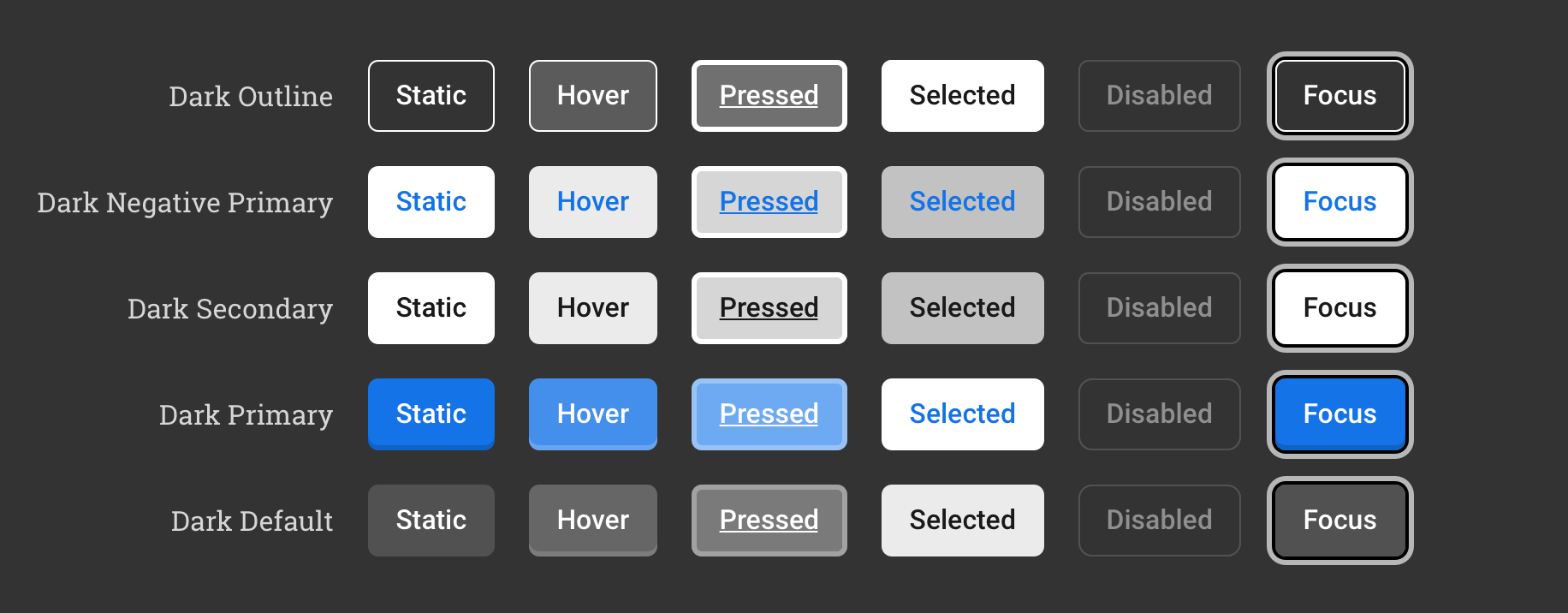
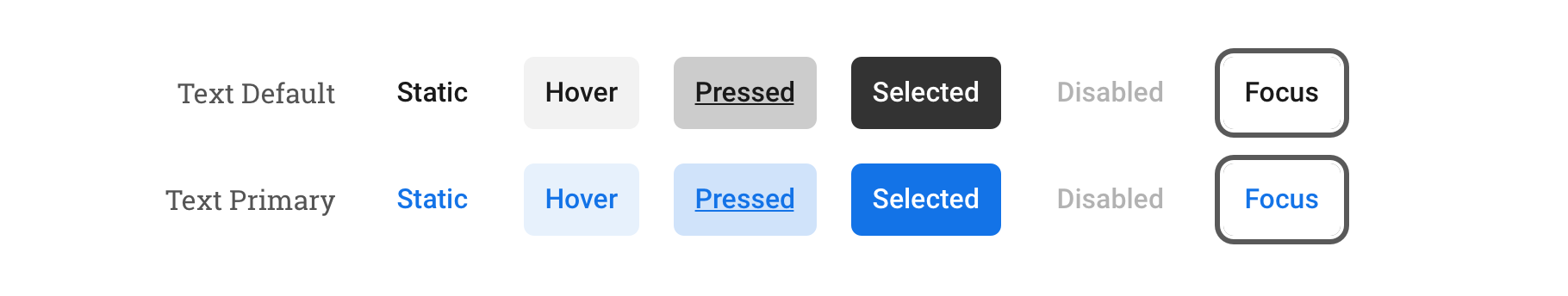
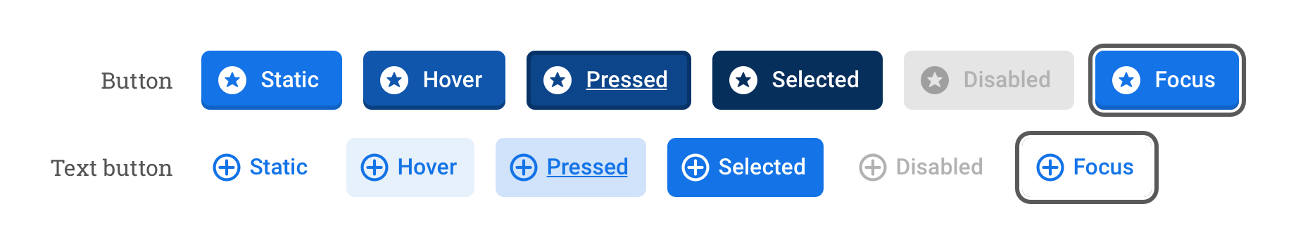
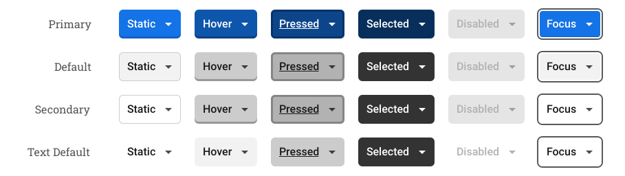
States
Components styles
Naviga Content Icon Pack
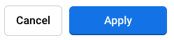
UIButton
Some styles and examples
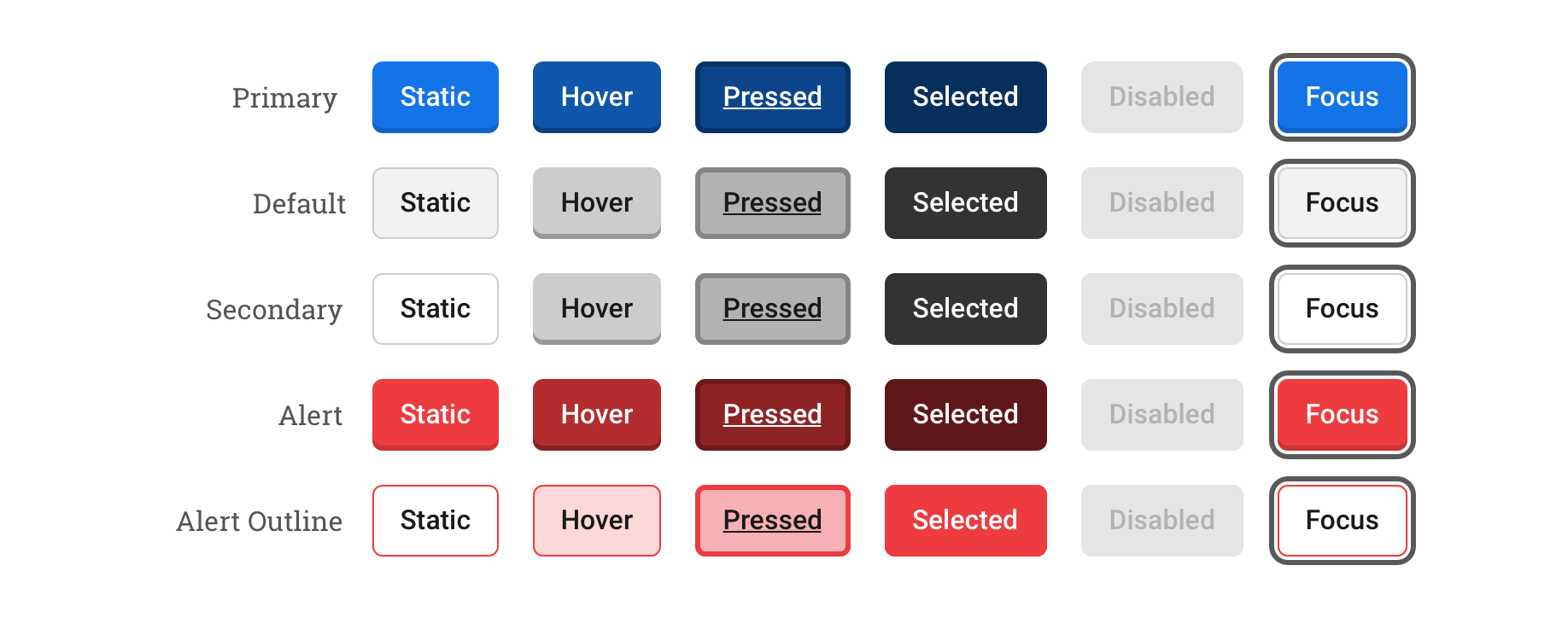
Width
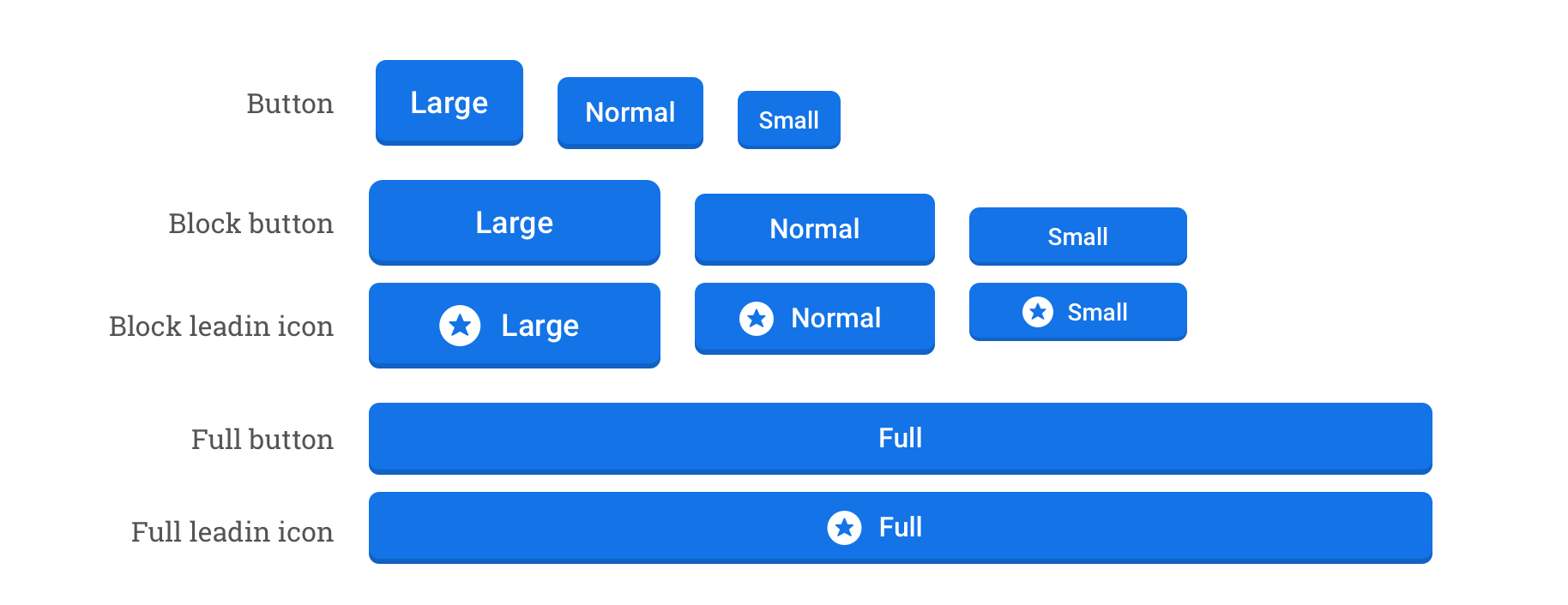
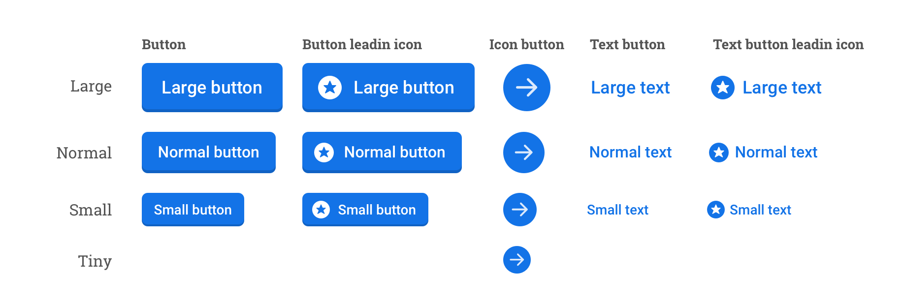
Sizes
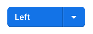
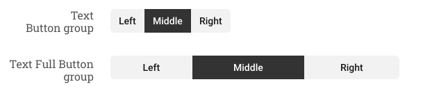
UIButtonGroup
Implementation
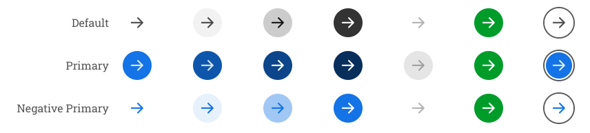
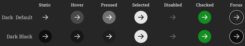
UIIconButton
Implementation
Styles and examples
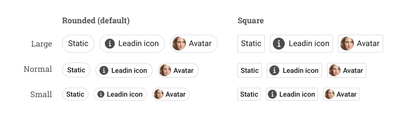
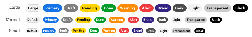
UIChip
Implementation
Styles and examples
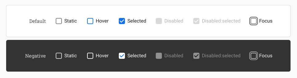
UICheckbox
Implementation
Styles and examples
UIToggle
Implementation
Styles and examples
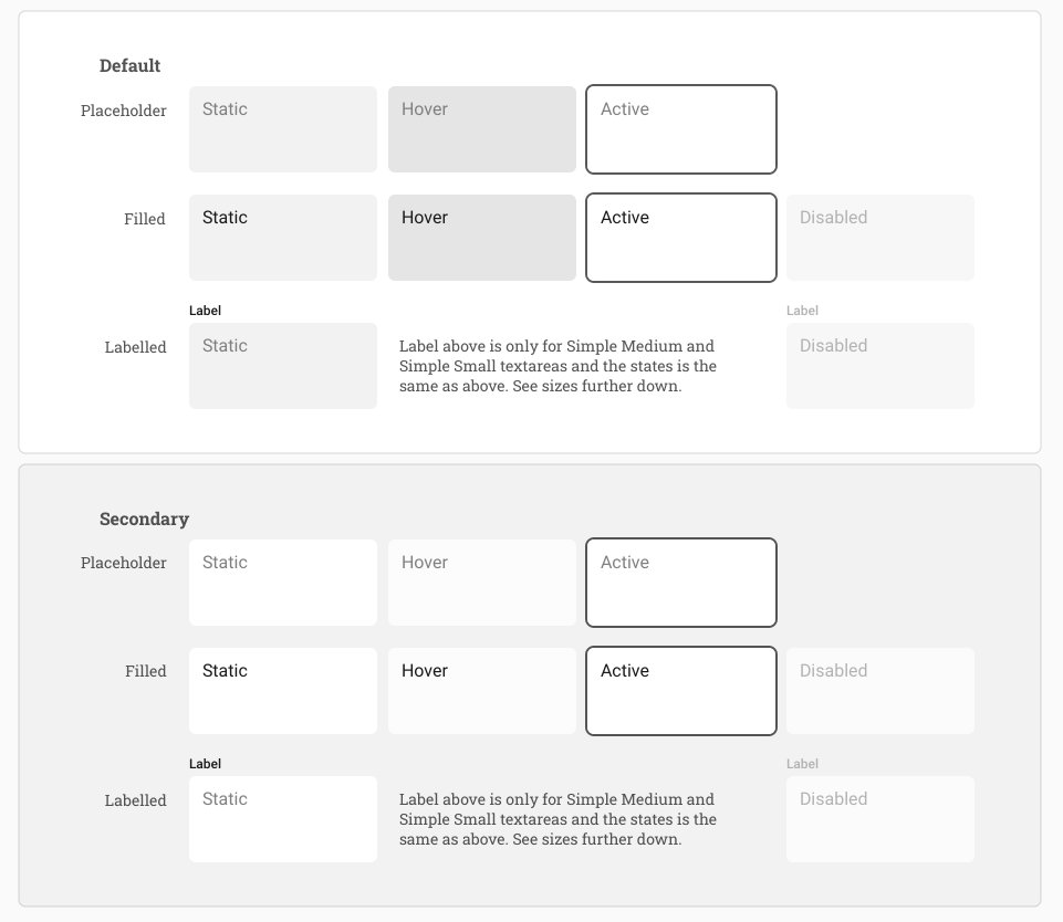
UITextarea
Implementation
Styles and examples
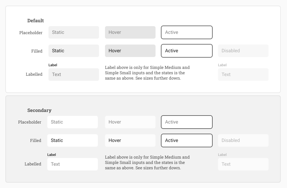
UIInputText
Implementation
Styles and examples
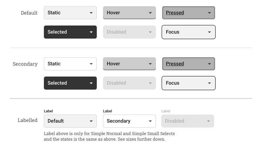
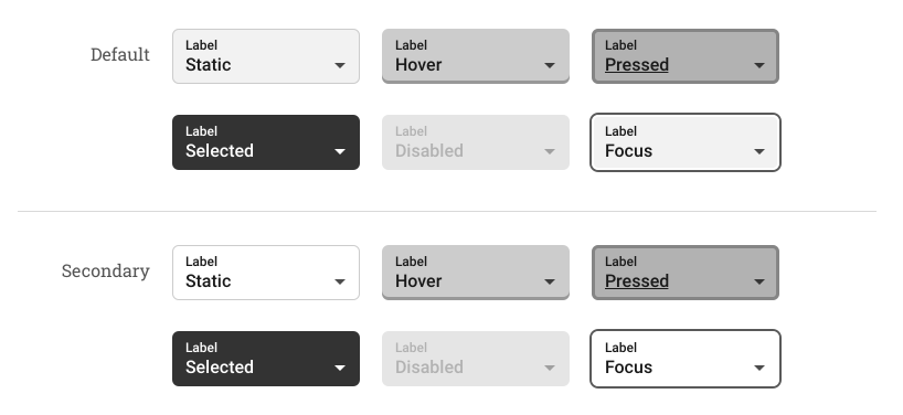
UISelect
Implementation
Styles and examples
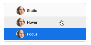
UIAvatar
Implementation
Styles and examples
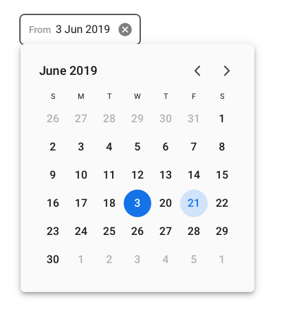
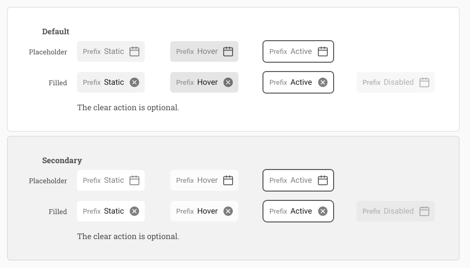
UIDatePicker
Implementation
Styles and examples
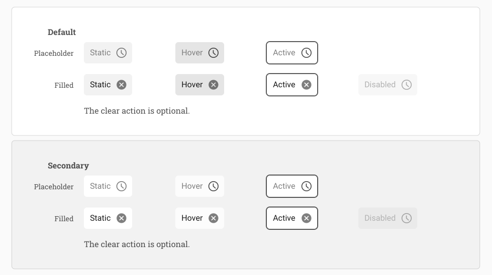
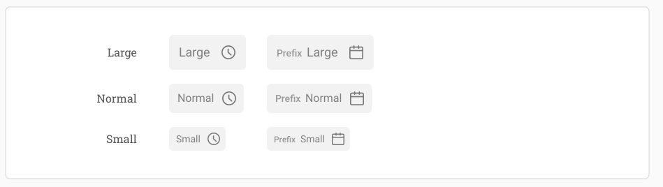
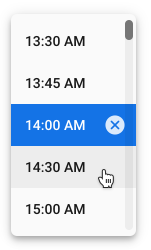
UITimePicker
Implementation
Styles and examples
UIFieldEditor
Implementation
Styles and examples
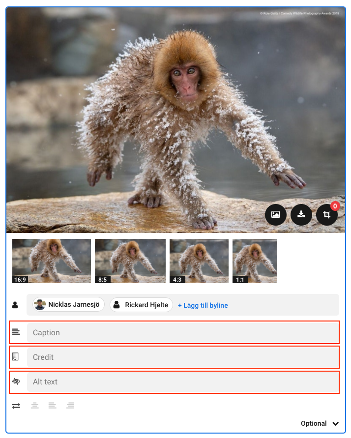
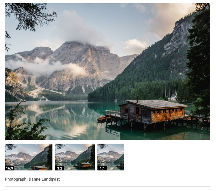
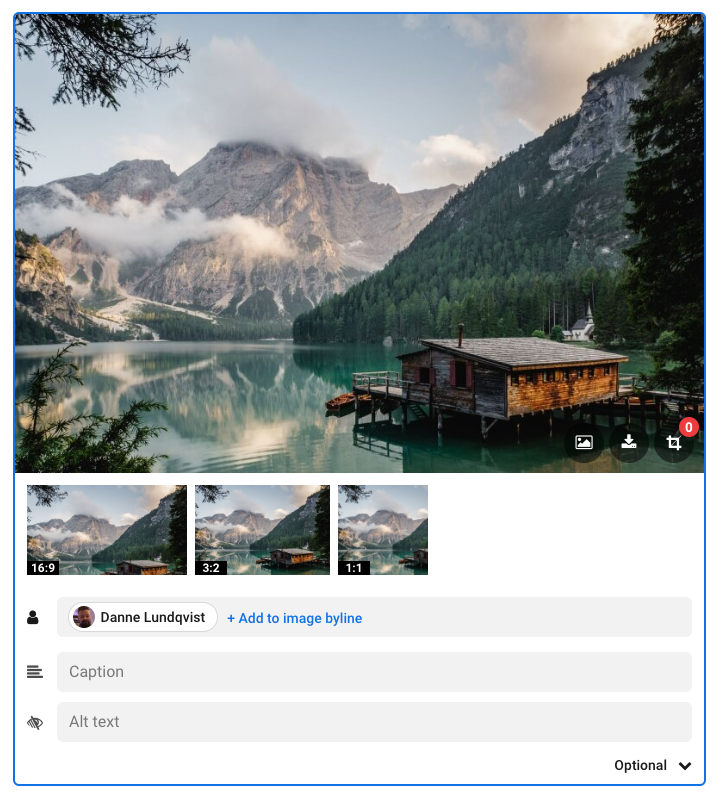
UIInlineImage
Implementation
Styles and examples
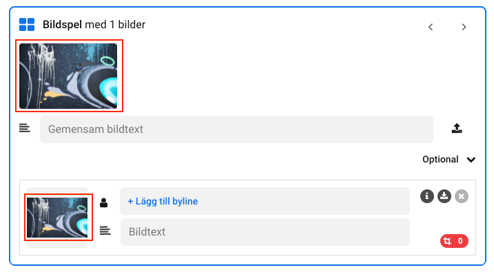
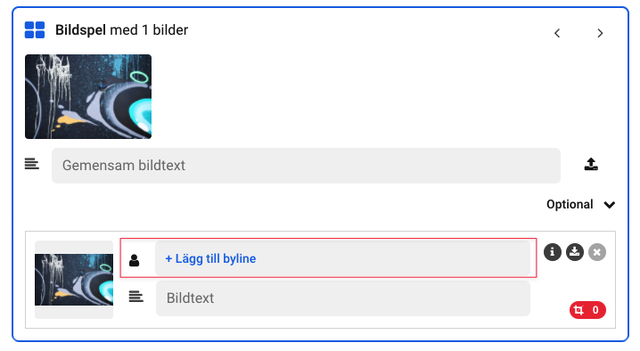
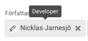
UIByline
Implementation
Styles and examples
UITooltip
Implementation
Styles and examples
UIPagination
Implementation
Styles and examples
UIDropdown
Implementation
Styles and examples
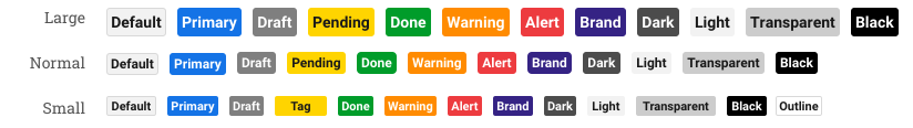
UIPill
Implementation
Styles and examples
UIIcon
Implementation
Styles and examples
UIButtonList
Styles and examples
UIIconBadge
Implementation
Styles and examples

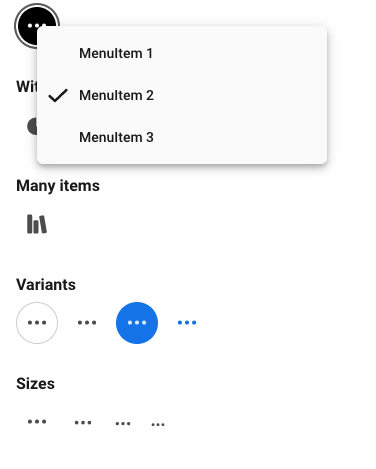
UIIconButtonMenu
Implementation
Styles and examples