CSS variables, colors and fonts
Get overview of what CSS variables that are provided by the writer. Also get a good overview of fonts and colors.
CSS variables
General
For using CSS variable you use it with var(--NAME-OF-VARAIBLE) for example if we to use one of our color variables it could look like this color: var(--dw-color-primary). It will pick out the defined color by the Writer so we can easily update this in the future without going over plugins.
Available variables
CSS variable name
Description
--dw-body-color
Body color for the Writer
--dw-link-color
Link color. Shouldn't be use to fallback to Writer
--dw-border-radius
Default border radius in content area
--dw-image-border-radius
Default image border radius
--dw-top-bar-height
Height of the top bar
Fonts
--dw-font-family-base
Default font-family
--dw-font-family-sans-serif
Default sans-serif font. Same as --dw-font-family-base
--dw-font-family-serif
Default serif font.
--dw-font-family-mono
Default mono font
--dw-font-size-base
Default Writer font-size
--dw-line-height-base
Default Writer line-height
Forms
--dw-input-bg-color
Default input background color
--dw-input-font-size
Default input font-size
--dw-input-color
Default input text color
--dw-input-color-placeholder
Default placeholder text color
--dw-input-padding-x
Default input x padding
--dw-input-padding-y
Default input y padding
Color variables
Every CSS color variable starts with the prefix --dw-color-.
General you will just use default color for each predefined color for the Writer and that will be easiest just to use prefix with the name and you will get the default color. For example --dw-color-primary or --dw-color-alert. That is the same as --dw-color-primary-500 or --dw-color-alert-500. Default colors are marked with *.
If you will work with a color in most cases it's enough to work with 100, 300, 500 (default) and 800 to get right feeling.
In color scheme under you can see what text color you have to use together with a specific background color to get correct contrast.
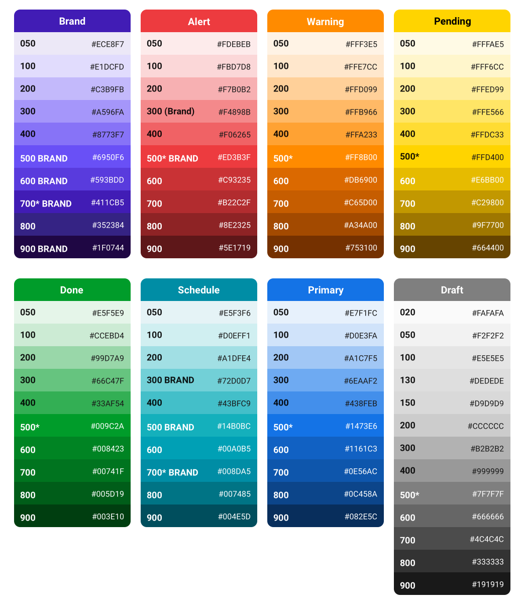
Converted color schema so it searchable
Draft
Alert
Warning
Pending
30 - #FAFAFA
50 - #FDEBEB
50 - #FFF3E5
50 - #FFFAE5
50 - #F2F2F2
100 - #FBD7D8
100 - #FFE7CC
100 - #FFF6CC
100 - #E5E5E5
200 - #F7B0B2
200 - #FFD099
200 - #FFED99
130 - #DEDEDE
300 - #F4898B
300 - #FFB966
300 - #FFE566
150 - #DEDEDE
400 - #F06265
400 - #FFA233
400 - #FFDC33
200 - #CCCCCC
500* - #ED3B3F
500* - #FF8B00
500* - #FFD400
300 - #B2B2B2
600 - #C93235
600 - #DB6900
600 - #E6BB00
400 - #999999
700 - #B22C2F
700 - #C65D00
700 - #C29800
500* - #7F7F7F
800 - #8E2325
800 - #A34A00
800 - #9F7700
600 - #666666
900 - #8E2325
900 - #753100
900 - #664400
700 - #4C4C4C
800 - #333333
900 - #191919
Done
Schedule
Primary
Brand
50 - #E5F5E9
50 - #E5F3F6
50 - #E7F1FC
50 - #ECE8F7
100 - #CCEBD4
100 - #D0EFF1
100 - #D0E3FA
100 - #E1DCFD
200 - #99D7A9
200 - #A1DFE4
200 - #A1C7F5
200 - #C3B9FB
300 - #66C47F
300 - #72D0D7
300 - #6EAAF2
300 - #A596FA
400 - #33AF54
400 - #43BFC9
400 - #438FEB
400 - #8773F7
500* - #009C2A
500 - #14B0BC
500* - #1473E6
500 - #6950F6
600 - #008423
600 - #00A0B5
600 - #1161C3
600 - #593BDD
700 - #00741F
700* - #008DA5
700 - #0E56AC
700* - #411CB5
800 - #005D19
800 - #007485
800 - #0C458A
800 - #352384
900 - #003E10
900 - #004E5D
900 - #082E5C
900 - #1F0744
* default value. I.e. var(--dw-color-primary) without number
Utility classes
The Writer provides utilises/helper classes for faster developing but mainly for standardised appearance.
General
.dw-shadow-box
With this class you will apply standard styles for how a shadow box should look in the Writer. This for not getting hundreds different looks for shadows.
Example:
.dw-shadow-border-{COLOR}-{SIZE}
This is created for easy mark up object. In the first case to mark up content parts as restricted. We wanted a standardised this so we easily can changed later on if we wanted.
You can use this we the whole color scheme naming.
Example:
Forms
.dw-form-group
Wrapping class for label and input standardised style
.dw-form-control
Applies to input and textarea for standardised style
.dw-form-group-inline-label
Uses together with .dw-form-group to wrap input and label to get label presentation inside input element for a hint.
States for forms
.is-valid
By combing this stats class with .dw-form-control you get a nice state presentation that the input is valid
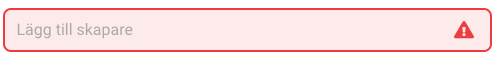
.is-invalid
By combing this stats class with .dw-form-control you get a nice state presentation that the input is invalid
Blocknodes
A blocknode is represented in the content area often append by a plugin. For example image-plugin, Youtubeembed-plugin and so on.
We have created classes for faster get a unit style. You should following classes together on same object.
<div class="dw-blocknode dw-blocknode--gray dw-blocknode--focus-transparent"></div>
.dw-blocknode
Head class that will add specific display property full width and standard padding to the blocknode.
.dw-blocknode--no-padding
Remove standard padding is for you will have a edge to edge presentation
.dw-blocknode--gray
Some element in the content area att presented with a gray background for mark is placement but not take up to much of the attention.. Use this class to get correct color.
.dw-blocknode--focus-transparent
If you use .dw-blocknode--gray you can use this class to get normal focus state when node is focused or selected.
.dw-blocknode--border-radius
Get standard border-radius applied to block node.
Classes to be used inside dw-blocknode
.dw-blocknode__header
Get standard united style for your header. Adds correct margin to icon if you prepend one.