
Plan Layout & Terminology
Page Sets
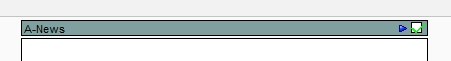
A plan consists of one or more-page sets, each of which contains one or more pages. Naviga Plan marks each page set with a colored bar at the top of every page in the set. Page sets frequently correspond to a portion of the newspaper, such as the sports section or feature section, though the content sections in most publications - such as Sports, Metro, Style or Living - may include more than one page set.
Sections
Sections in Naviga Plan are specific advertising Sections or Categories from Naviga Ad. Naviga Ad (or other Ad System like AdManagerPro or NCS Advertising) assigns a Section to Display ads and a Category to Classified ads when they schedule the ad. Each page set or page can be assigned one or more sections. This allows Naviga Plan to automatically plan each ad onto a page that has been assigned the ad’s section.
When page planners plan each edition, they can have Naviga Plan automatically stack ads in accordance with any ad position requests the ad-order entry operators designated when they took the orders for those ads, and the stacking preferences designated for each page in the plan.
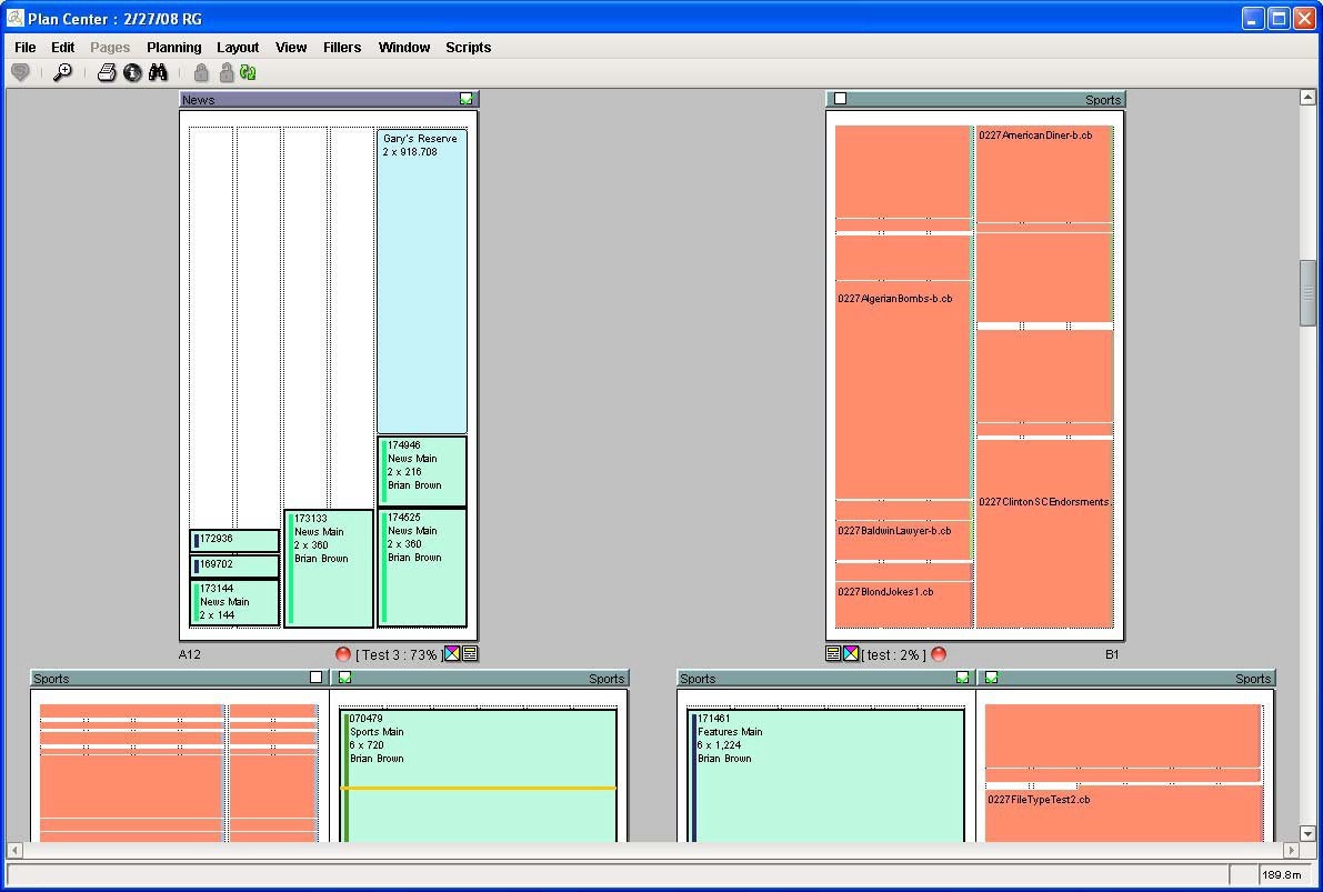
Naviga Plan provides paper planners and editors with a graphic representation of each page set in the plan, so they can easily see where ads have been placed on the pages. If using this in conjunction with NCS Content, you will also be able to see a read-only view of editorial stories on the pages.
Navigating within Plan
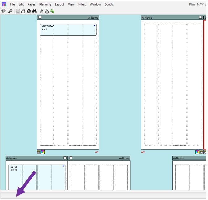
The Plan layout area has a toolbar across the top and displays the pages in the plan. Several indicators appear for each page. There is a message bar across the bottom.
Any of four boxes may also be showing on the layout window, the Ad List, the Pages palette, the Filler Library, and the Loading Error box:
The Ad List dialog box has four panels: The Ads panel displays a list of all the ads scheduled for the plan you have open; the Holds panel allows you to see all ads scheduled for the plan but that are on hold; the Standbys panel allows you to see all ads scheduled for the plan but that are on standby, and the fillers list shows fillers that can be used in the Plan.
The Pages palette allows you to move easily from page to page in the plan. See Using the Pages palette
The Ad List Fillers panel allows you to select and place fillers from a library of fillers. See Using the Fillers panel
If there are any loading errors, the Loading Errors box opens. Correct these errors before proceeding. See Dealing with loading errors.
When you open a plan, Naviga Plan remembers the last plan you had open, opens the same boxes, and places them where you had arranged them, until you log out of that Plan session.
Facing pages within a page set or within nested page sets are displayed as adjacent pages. First and last pages of page sets appear as separate pages.
Note: You can designate that pages be viewed in printing pairs.
When ads (and stories if using NCS Content) have been placed on the pages, they are clearly marked and labeled. Stories are read only in Naviga Plan. Any editing or moving of stories must be done from NCS Content.
Note: If your site is set up to use bleeds (normally used in magazine publishing), story media, ads, and ad media can be placed so that they extend beyond the pages’ borders.
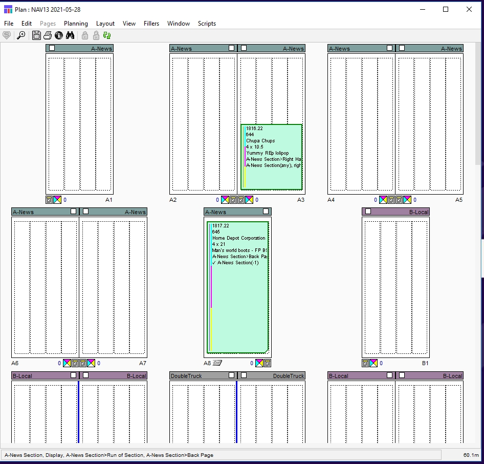
If a page has been set to show outlines only, previews of stories and ads do not appear. Below on the left is a page that shows element outlines only.

If a page has been set to show previews, previews of stories and ads appear (see image on the right above). Also see Preview a page.
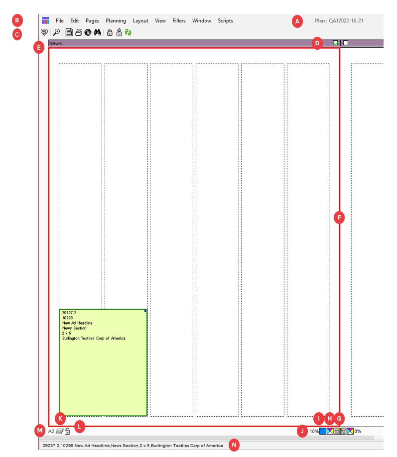
The Plan:
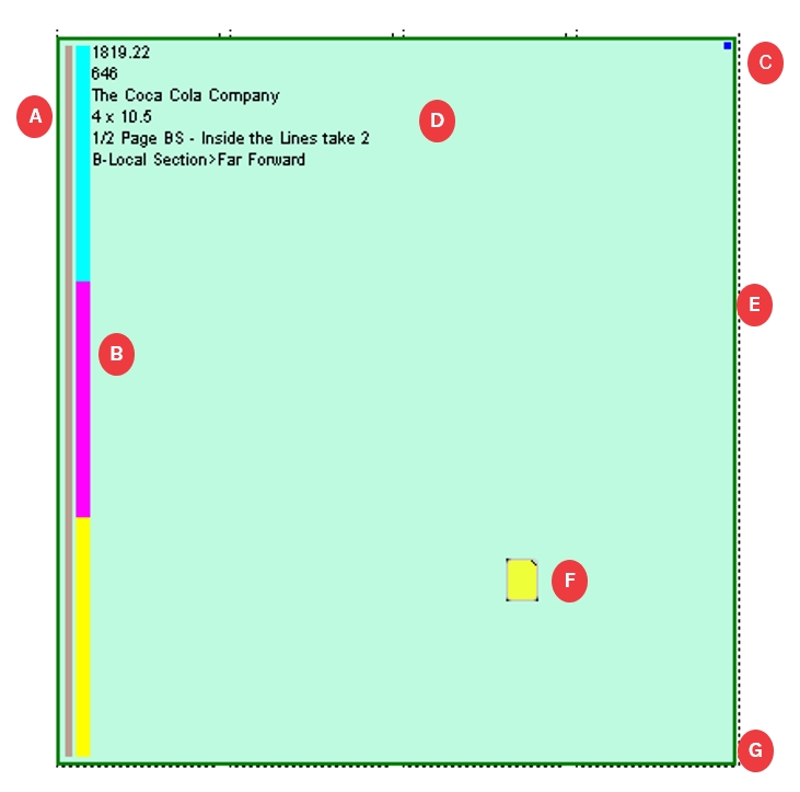
A
Plan Name
The name of the plan.
B
Menu bar
Contains the menus. Click on an item to open its menu.
C
Plan Toolbar
The Plan toolbar allows you to perform several functions with a single click.
D
Page Checked Out box
Indicates whether the page is checked out:
blank--not checked out.
green--checked out to you.
red--checked out to someone else.
E
Page Header and labels
Information about the page and the page set, including Page Set Checked Out box and if they have been designated, Page Info tag and Page Set name:
Page description. See Attributes panel
Page info tag. See Attributes panel
Page set name. See Changing information about a page set
F
Page Indicators
When a page is selected, the border appears in red.
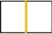
When a page spread is designated as facing (on different sheets of paper), the border between the pages appears in gold. Indicates that the spread can accept a page double‐truck ad.
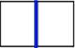
When a page spread is designated as center or through (on the same sheet of paper), the border between the pages appears in blue. Indicates that spread can accept a true double‐truck ad.
G
 Classification (Sections) icon
Indicates Sections/Categories have been assigned to the page. Place your cursor over the icon and the list of classifications appears in the plan information bar. See Managing running orders.
H
Color Indicator icon
Indicates whether the page uses print colors: cyan, magenta, yellow, or other (purple). See Adding color to a page
Note: The indicator always appears when a color is designated. It may or may not appear if no color is assigned to the page, depending on your preference. See Setting Plan preferences.
J
Used Percentage Indicator
The percentage of space on the page that been used. It does not include reserved spaces, margins, gaps or gutters.
K
Page Notes icon
Indicates there is a note attached to the page. Hover over the icon and the note appears in the Plan Information bar. See Adding notes to plans, pages, ads, and reserved spaces
L
Locked Indicator icon
Indicates the page is locked. When the page is not locked, no icon appears.
M
Page Set Letter and Page Number Designation
Indicates the page set letter designation and the page number within the page set.
 Site Status icon
Indicates the site’s designation of the page’s progress. The color depends on the status. See Understanding status indicators in the Plan. The color appears as a square around the Page Set Letter and page Number.
 Color of the Page number
This will only be seen in Integrated NCS Content systems. A Red page number indicates that this page does not yet exist in the NCS Content side of the system.
N
Plan Information bar
Contains information about the page.
The left portion indicates information about whatever is under the cursor. See The Plan Information bar.
Clicking on any spot within the page will display the x and y coordinates of that spot on the page.
A Plan Note icon (
 ) to the left of the memory indicator (bottom right of the screen) appears when a user has added a plan note to the plan. Hover the cursor over it to read. See Adding notes to plans, pages, ads, and reserved spaces
Clicking and Hovering on Objects
Naviga Plan is used primarily for planning and arranging ads in the page layouts. You cannot place or rearrange stories directly in Naviga Plan, and you will only see stories if you are integrating with NCS Content.
Naviga Plan users, if their user profiles allow it, can move placed ads, fillers, and headers. By clicking or hovering over various items or places in the Plan, you can perform various actions or display information in the Information bar.
Single Click:
A page
Selects the page. The border of the page is highlighted in red. The Info bar shows the X,Y coordinates of the specific page location you clicked.
An ad or reserved space
Selects the ad or reserved space. Click outside the ad or reserved space to deselect.
An ad or reserved space note
Selects or deselects the note. May also select the ad or reserved space.
The area between pages
Deselects everything except notes.
Edit > Deselect All
Double click:
A page’s title bar
Selects the page set. The borders of all pages in the selected page set are highlighted in red.
Note: Does not deselect any other already-selected pages.
• Edit > Select Page Set
• Ctrl+Shift-A (Windows) or Command+
Shift-A (Mac OS)
Below a page or spread
Zoom the spread to fit the window.
Shift-click:
Pages
Selects multiple pages, but not a range of pages.
Ctrl-Click:
A page
When you have more than one page selected, selects the page and deselects all other selected pages.
Alt-Shift-click:
A page followed by another page
Selects the range of pages between the two selected pages
Hover:
An ad or reserved space note
The Info bar displays the text of the note.
A Page Note icon.
Read the page note in the Info bar.
A Plan Note icon
Read the plan note in the Info bar.
The Page Checked Out box
The Info bar shows the name of the user who has the page checked out.
The Classifications icon
Info bar shows the classifications assigned to that page.
Open the Page Attributes panel and click the Classifications tab.
Page Set Letter and Page Number Designation
Info bar shows whether the page is common or unique and indicates its parent, if any.
A Locked Indicator icon
Info bar says, “Page locked.”
Checking out pages
Whenever you make any change to a page, the page is checked out. (See field D above) Once the page is checked out, other Plan users cannot make changes to it until you check the page back into the database.
Note: NCS Content users, however, can open page sets in InDesign and add editorial items to pages, regardless of whether someone has those pages checked out in Naviga Plan. Avoid making changes to the Plan such as adding or deleting pages or placing ads—while a user has the same page set open in InDesign.
When you check out a page, other pages in the plan are not checked out. Other Plan users can check them out and work on them.
If no one, including you, has checked out a page, the Page Checked Out box is blank ( ). If you check out a page, the Page Checked Out box is marked with a green check mark (
  ). To check the pages back in simply save the plan.
If someone else checks out a page, the Page Checked Out box above the page is marked with a red check mark (  ).
).
Note: You can hover the mouse pointer over this check mark to see the name of the user who has the page checked out, displayed in the Information bar. See Working with Objects in the Plan Layout. Changes that check out the page include moving an ad, tracking a page, changing page attributes, locking a page, and so forth.
Note: If you open a plan and do not check out a page, someone else may check it out while you have it open. When you try to make a change to that page, you receive a warning that the page is checked out and the red check mark appears.
Using the Plan toolbar
The Plan toolbar allows you to perform several functions with a single click.
Note: You can set a preference to display or not display the toolbar. See Setting Plan preferences.
The Plan Toolbar:
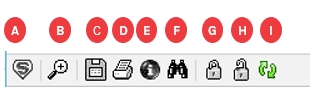
A
 Assign Page Set icon
Opens the Assign Page Set dialog box. See Assigning pages to a page set
B
 Zoom In icon
Click and then lasso within a page to zoom in. See Zoom In / Out
C
 Save Button
Save the plan
D
 Print Dummy icon
Prints page dummies. See Printing page dummies.
E
 Info icon
Opens the information dialog box for the plan (if nothing is selected) or information about the selected item: page, ad, header, or filler.
F
 Find Ad icon
Opens the Find dialog box. See Finding an ad in the active plan
G
 Lock icon
Locks the selected items to prevent users from inadvertently disturbing the layout. If a page is selected but nothing on that page is selected, it locks the page. If an item or items are selected, it locks the items.
H
 Unlock icon
Unlocks the selected items. If a page is selected but nothing on that page is selected, it unlocks the page. If an item or items are selected, it unlocks the items.
I
 Refresh Plan icon
Refreshes the plan and the Ad List dialog box, including the Ads list, Holds list, and Standby list. See Refreshing plans.
The Plan Information bar
When you hover the mouse cursor over certain Plan items, the gray space at the bottom of the window can contain the following information:
Page Checked Out box 
To Whom the page is checked out.
Any position on a page, click the mouse in the white part of the page
The cursor coordinates.
Classifications (sections) icon 
The classifications assigned to the page.
Page Signed Off indicator 
Confirms that page is signed off and who approved it and when.
Page Set Letter and Page Number Designation 
Indicates whether the page is unique or common (has shared content), and displays the pageid, layoutid and mpdid.
Locked Indicator icon 
Confirms that the page is locked.
Ad or reserved spaces notes 
The text of the note.
Page Notes icon 
The text of the note.
The Plan Notes icon 
The text of the note.
The ad or reserved space
Displays the outline info for that type of ad/reservation/filler/etc. (from user preferences)
The information bar is along the bottom here:
Right-Click Menu
Hiding and showing pages and page sets
When you are working in a large plan, you may want to temporarily hide some of the pages you do not need.
When you hide pages, they are only hidden from you and not from other users who have the plan open. If you hide the plan and then show it, all pages show.
You can hide selected pages, selected page sets, or all page sets other than the selected one.
To hide a page, right-click (Windows) or Control-click (Mac OS) on it. From the menu, choose Hide Page.
To hide a page set, right-click (Windows) or Control-click (Mac OS) on it. From the menu, choose Hide Page Set.
To hide all page sets except one, select the page set you want to remain showing and right-click (Windows) or Control-click (Mac OS) on it. From the menu, choose Hide Other Page Sets.
In the Info Header bar to the right of any hidden pages, a left indicator ( ) appears. In the Info Header bar to the left of any hidden pages, a right indicator (
  ) appears.
To show all hidden pages, right-click (Windows) or Control-click (Mac OS) on any page. From the menu, choose Show All Pages.
To show a hidden a page, right-click (Windows) or Control-click (Mac OS) on the page with the indicator pointing toward it. From the menu, choose Show Page. From the list of hidden pages, select the page.
To show a hidden a page set, right-click (Windows) or Control-click (Mac OS) on the page with the indicator pointing toward it. From the menu, choose Show Page Set. From the list of hidden page sets, select the page set.
Working with Objects in the Plan Layout
A Plan layout includes many kinds of objects, such as ads, stories, fillers, headers, space holder fillers, and so forth. The Plan represents each object type in a distinctive way. You can decide whether to track these objects in preview mode or by their outlines only. You can also lock objects, add notes to them, and get information about them.
Layout symbols
A page layout can include several types of items, such as stories (with NCS Content integrations only), display ads, headers, classified liners, fillers, banners, and reserved space boxes. Each has a system of color and coding symbols.
When you view these items as outlines (View -> Outlines Only), each item displays information that includes the item’s size, either as width x depth or as depth x width, depending on the preference you have chosen. See Setting Plan preferences
User can also affect some of these settings with choices made in the View -> Show menu.
Important: To be certain the display information is current, refresh the plan. See Refreshing plans.
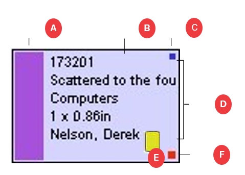
Understanding display ad symbols
Each display ad displayed on the Plan layout has several indicators.
A
Classification bar
Solid thin Color bar representing the Section of the display ad (the gray bar along the left edge in picture above). Optionally, the ad layout may be filled with the classification color, in which case the classification bar will not be displayed since the entire ad will be colored by class/section. The colors are assigned by Plan (not user configurable) to enable quick distinction of classification groups.
B
Color bar
Displays the colors used in the display ad: cyan, magenta, yellow, and other (purple).
C
Locked Indicator
A blue box in the top right indicates the display ad is locked.
D
Textual Information display
Displays textual information about the display ad. (Info displayed is configured in Edit > Preferences)
E
Status Indicator
If Display Status is enabled (View > Show), the color of the display ad’s border is the color of the ad’s status flag. If not selected, the border will be gray
F
Ad Note Indicator
A yellow box indicates an Ad Note has been attached to the ad. Select the note and from the Plan menu choose File > Notes.
G
General Indicator
A red box in the lower right corner indicates one of the following conditions exists (not shown in screenshot, but would be inside the box at position G):
The ad was not placed in its preferred position.
There is a clash code clash.
The ad is a coupon ad.
The ad is a scatter ad.
There is an option to display a large red center instead.
Note: You can designate the information options included in the textual information and their order. See Setting Plan ad outline preferences
Additional display ad indicators
Outlines
System Generated:

If an ad has a single horizontal orange bar across it, the size of the ad has been changed slightly to accommodate the layout.

If an ad has two horizontal orange bars across it, the ad’s actual size does not match its booked size.

If an ad is a double‐truck ad, a vertical magenta bar indicates the display ad is laid out over two pages.

If an ad has its upper‐right corner cut off, it is a split‐run ad. (Split Runs are not supported with Naviga Ad)
If the ad has its lower right corner cut off, it is in a guaranteed position.
User Designated:

Normally an ad’s status color code is shown in the ad’s border. You can opt to have the layout filled with the color. To enable this, select View > Track Status

Normally an ad’s advertising classification color code is shown in a colored bar down the left side of the ad. You can opt to have the layout filled with the color. To enable this, select View > Show > Color by Class
Previews

When you preview pages, page sets or selection in the Plan, each ad is represented by a preview.

If a display ad appears as an outline and has a red X through it, no preview is available. In Naviga Ad there is no material linked to the ad.
If a display ad appears with a yellow diamond with a black exclamation, then there is a material ID in Naviga Ad, but there isn’t a pdf marked final in the components of that material record. (Or approval is required, and it hasn’t been approved)
If a display ad appears as an outline and has a blue X through it, there is not enough memory to show the preview. Change the view of the plan to Outlines Only and set only that page to Preview Page or select the ad and choose View > Preview Selection.
Understanding header symbols
Each header displayed on the Plan layout has several indicators.
A
Classification bar
Color bar representing the classification of the header. The colors, assigned by the Plan, enable quick distinction of classification groups.
B
Selected Status
If the header is yellow, it is not selected. If it is gray, it is selected.
C
Locked Indicator
A small blue box indicates the header is locked.
D
Textual Information display
Displays textual information about the header. If header is too small, some textual information may be truncated. You can zoom in to see more of the text.
Note: You can designate the information options included in the textual information and their order. See User Preference Setup
Note: If you have headers with no ads under them, you can suppress them from printing. See Suppressing ad headers
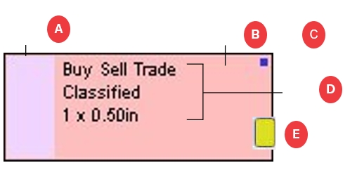
Understanding classified liner symbols
Each classified liner displayed on the Plan layout has several indicators.
A
Classification bar
Color bar representing the classification of the liner. The colors are assigned by Naviga Plan to enable quick distinction of classification groups.
B
Selected Status
If the liner is purple, it is not selected. If it is gray, it is selected.
C
Locked Indicator
A blue box indicates the liner is locked
D
Textual Information display
Displays textual information about the liner.
E
Ad Note Indicator
A yellow box indicates an Ad Note has been attached to the liner. Select the note and from the Plan menu choose File > Notes.
F
Failed Preferred Indicator
A red box indicates the liner was not placed automatically in its preferred position. There is an option to display the entire ad in red.
Note: You can designate the information options included in the textual information and their order. See User Preference Setup
If an ad has its upper-right corner cut off, it is a split ad. (Split ads are not supported in Naviga Ad).
If a liner has a large red center, the Show menu has been set to designate a special situation. Depending on the setting, it indicates the following:
The liner was not placed in its preferred position.
The liner is in violation of its clash code.
The liner contains a coupon.
The liner is a scatter ad.
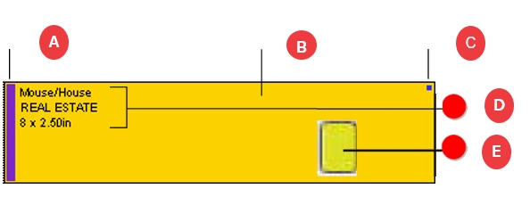
Understanding filler symbols
Each filler displayed on the Plan layout has several indicators.
A
Classification bar
Color bar representing the classification of the filler. The colors are assigned by Naviga Plan to enable quick distinction of classification groups.
B
Selected Status
If the filler is pink, it is not selected. If it is gray, it is selected.
C
Locked Indicator
A blue box indicates the filler is locked.
D
Textual Information display
Displays textual information about the filler.
E
Ad Note Indicator
A yellow box indicates an Ad Note has been attached to the liner. Select the note and from the Plan menu choose File > Notes.
Note: You can designate the information options included in the textual information and their order. See User Preference Setup
Understanding banner symbols
Each banner displayed on the Plan layout has several indicators.
A
Classification bar
Color bar representing the classification of the banner. The colors are assigned by Naviga Plan to enable quick distinction of classification groups.
B
Selected Status
If the banner is orange, it is not selected. If it is gray, it is selected.
C
Locked Indicator
A blue box indicates the banner is locked.
D
Textual Information display
Displays textual information about the banner.
E
Ad Note Indicator
A yellow box indicates an Ad Note has been attached to the liner. Select the note and from the Plan menu choose File > Notes.
Note: You can designate the information options included in the textual information and their order. See User Preference Setup
Last updated
Was this helpful?